Challenge
San Juan Beverage Company's Double Spiked line needed a site that sells like the can: bold product first. At the same time it had to support "where to buy," brand story, and co-packing for trade partners. Consumer and B2B intent lived on the same domain and were stepping on each other.
The old structure buried SKUs. Product discovery felt secondary to corporate filler. Trade visitors looking for co-packing had to dig through a consumer-shaped experience. Marketing needed campaign-ready templates for seasonal flavors and new packs without a redesign every launch.
This was a brand site and SEO architecture problem: one company, two journeys, one coherent design system.
Redesign
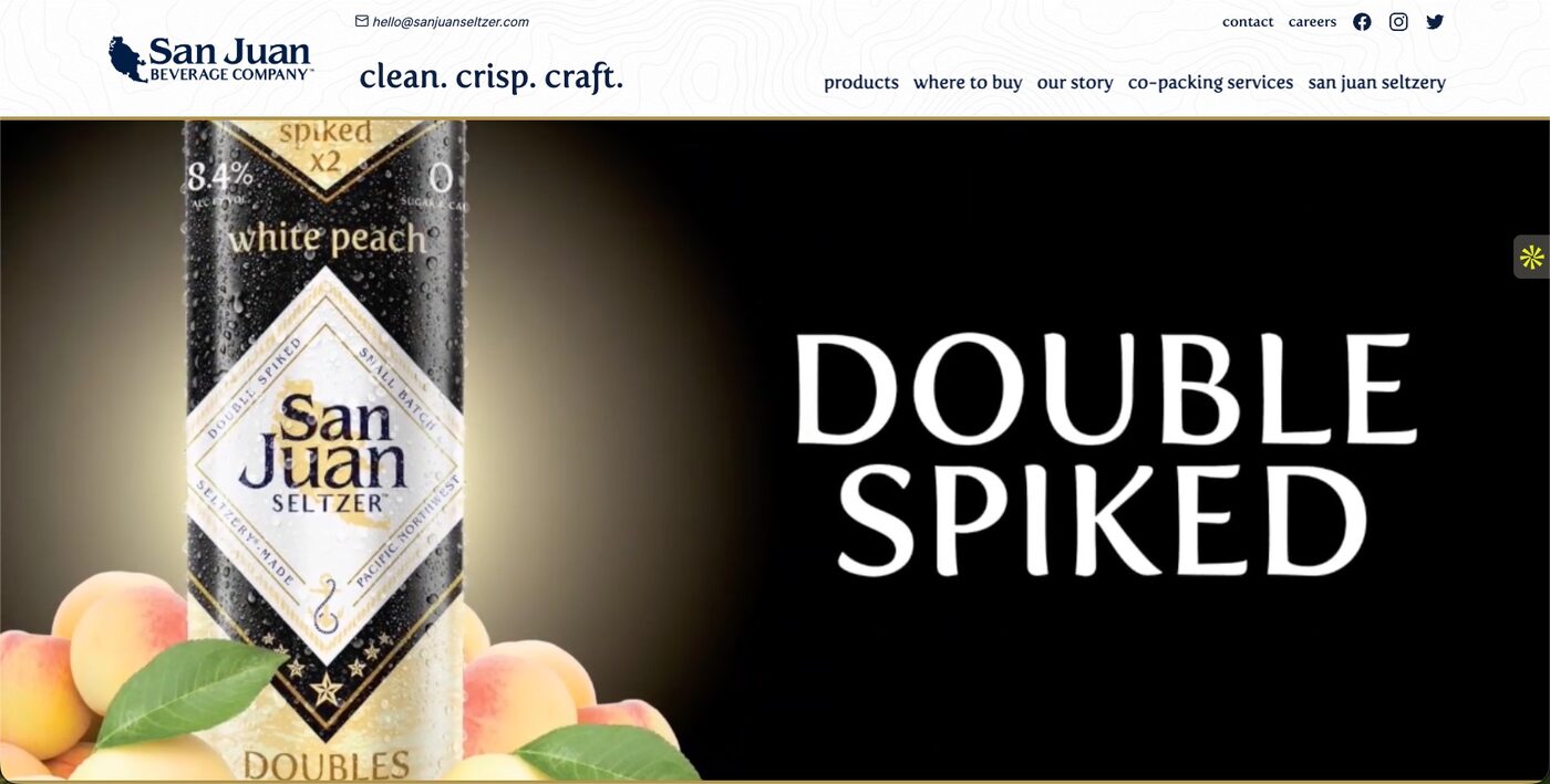
I rebuilt around discovery and brand, with product photography and typography doing the heavy lifting (for example Double Spiked line heroes).
Product-led heroes. Full-bleed photography and large type for line launches. The can is the pitch; the site does not apologize with a wall of corporate copy first.
Split journeys. Products and where to buy for consumers. Co-packing and company story for trade. Same brand system, different next steps, so neither audience has to reverse-engineer the nav.
Brand chrome. "clean. crisp. craft." runs through header, type, and layout, not only the logo lockup. Shelf identity and web identity stay aligned.
Campaign-ready templates. Homepage and product page patterns built so marketing can ship seasonal flavors and new packs without reinventing the layout each time.
Same rebuild discipline as other Puget Sound brand sites I have shipped: preserve equity and rankings where they exist, fix structure underneath, migrate content and metadata deliberately.
SEO and technical foundation
Product and line pages are structured for brand and product queries: seltzer line names, flavors, co-packing, and related commercial intent. Navigation and internal links follow a logical path: products → where to buy → story → co-packing, so crawl paths and human paths match.
Metadata and share images are clean so product launches look right in search and social, not like a random CMS default. Hero media is optimized for performance without flattening the shelf appeal that sells the SKU. Modern front-end delivery (image optimization, share-ready Open Graph patterns) keeps the CPG look fast enough that the photography still lands.
Result
A CPG site that puts the product first, keeps retail and co-packing easy to find, and gives marketing a durable SEO base for new SKUs and campaigns. Consumer and trade journeys no longer compete for the same homepage real estate.
The brand can launch flavors without treating every pack as a one-off microsite project.