From Spreadsheets to Dashboards: Modernizing Your Business Data Management
There's a moment in every growing business when spreadsheets transform from helpful tools into operational bottlenecks. You're probably experiencing it right now if you're reading this. Someone on your team maintains "the master spreadsheet" that everyone needs but nobody fully understands. Updates happen manually, usually right before important meetings. Multiple versions circulate via email with names like "Sales_Report_Final_v3_ACTUALLY_FINAL.xlsx." Critical business decisions wait on one person to compile data from six different sources.
Spreadsheets aren't inherently bad. For ad-hoc analysis, quick calculations, and one-off projects, they're excellent. But using spreadsheets as your primary business intelligence system is like using a bicycle to deliver freight—technically possible, but painfully inefficient and completely unsustainable at scale.
The Warning Signs You've Outgrown Spreadsheets
Most businesses resist moving away from spreadsheets because they're familiar, flexible, and "good enough." But "good enough" has a hidden cost that grows exponentially as your business scales.
The manual update trap. Someone spends hours each week copying data from various systems into spreadsheets, formatting it consistently, and generating reports. This person becomes a bottleneck—nobody else quite understands their formulas or process. When they're out sick or on vacation, reporting stops. The business literally can't see its own performance without this one person's manual labor.
The version control nightmare. Multiple people need access to the same data, so spreadsheets get emailed around. Someone makes updates to version 2 while someone else updates version 3, and nobody is quite sure which version contains accurate information. You end up in meetings where different people reference different numbers, and half the meeting gets wasted reconciling data instead of making decisions.
The formula fragility problem. That complex spreadsheet with nested formulas and cross-sheet references works perfectly—until someone accidentally deletes a row or adds data in the wrong format. Suddenly formulas break, calculations error out, and nobody notices until a decision gets made based on wrong numbers. Debugging spreadsheet formulas is like detective work, and the person who built them is usually the only one who can fix them.
The scale ceiling hits hard. Spreadsheets handle thousands of rows reasonably well. Tens of thousands of rows get sluggish. Hundreds of thousands of rows become unusable. When your business growth pushes past spreadsheet performance limits, you face an urgent crisis—migrate to a real system or constrain your analysis to smaller data samples that miss important patterns.
The access control impossibility. You need to share data with your team, but spreadsheets only offer crude access control. Either someone has access to the entire spreadsheet or they don't. You can't easily show sales data to the sales team, financial data to the finance team, and summary data to executives—all from the same data source with appropriate permission levels.
Calculating the Real Cost of Spreadsheet Dependency
The cost of spreadsheet-based workflows is rarely calculated honestly. Let's do the math with a realistic scenario.
Your operations manager spends 10 hours per week maintaining spreadsheets—pulling data from your CRM, updating inventory numbers, calculating metrics, and generating reports. At a fully-loaded cost of $75 per hour, that's $750 weekly or $39,000 annually. Your sales team collectively spends another 20 hours per week updating sales tracking spreadsheets and cross-referencing information. That's another $78,000 per year.
Now add the opportunity cost. How much revenue slips away because your team lacks real-time visibility into inventory, sales pipeline, or customer behavior? How much time gets wasted in meetings reconciling conflicting data? How many bad decisions happen because data was outdated or someone made updates based on the wrong version?
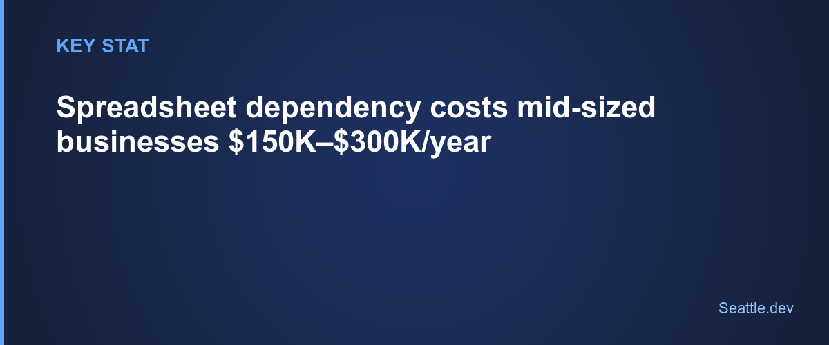
Conservative estimate: spreadsheet dependency costs a mid-sized business with 50 employees somewhere between $150,000 and $300,000 annually in direct labor costs and opportunity costs. That's before counting the stress, frustration, and employee satisfaction costs of requiring skilled professionals to perform repetitive manual data work.
What Dashboards Actually Solve
Modern business dashboards eliminate manual data work by automatically connecting to your data sources, processing information in real-time, and presenting it in formats optimized for decision-making.
Automation replaces manual updates. Instead of someone copying data weekly, dashboards connect directly to your CRM, financial systems, inventory databases, and other sources. Data flows automatically and updates continuously. The person who used to spend hours on manual updates can focus on analyzing trends and making recommendations instead.
Single source of truth ends version chaos. Everyone views the same dashboard showing the same data at the same time. No more emailing spreadsheets or wondering which version is current. Updates appear instantly for all users. Historical data is preserved automatically, so you can always look back at how metrics appeared at any point in time.
Real-time visibility enables faster decisions. When data updates continuously rather than weekly, you spot problems faster and capitalize on opportunities immediately. Your sales team sees pipeline changes as they happen. Your operations team catches inventory issues before stockouts occur. Your executives make decisions based on current reality rather than last week's snapshot.
Appropriate access for every user. Different users see different views of the same data based on their role and needs. Sales representatives see their own numbers and team comparisons. Sales managers see team performance and pipeline health. Executives see high-level KPIs and trends. Everyone gets exactly the information they need without seeing irrelevant or sensitive data.
Reliability through automation. Formulas and calculations happen consistently every time without human error. Data validation catches problems at the source. Audit trails track changes automatically. The system works the same way regardless of who's using it or whether your data specialist is available.
Understanding What to Migrate First
Attempting to replace every spreadsheet in your business simultaneously is a recipe for failure. Start with the highest-value, highest-pain spreadsheets and expand from there.
Look for the reports you generate most frequently. Weekly sales reports, daily operations metrics, monthly financial summaries—these regular reports deliver the fastest ROI when automated. Every manual report generation you eliminate saves time forever.
Identify the data that drives decisions. What information do executives review before making strategic decisions? What metrics determine whether sales targets are being met? What operational data signals problems that need immediate attention? Dashboards that inform important decisions deliver value that far exceeds implementation cost.
Start with data sources you control. If critical data lives in systems with good APIs or database access, start there. Avoid beginning with data sources that require complex custom integrations or manual exports. Build momentum with quick wins before tackling harder problems.
Target cross-functional data needs. Spreadsheets that combine data from multiple departments or systems deliver especially strong ROI when automated. These are usually the most painful to maintain manually and benefit most from automated integration.
The Migration Process That Minimizes Disruption
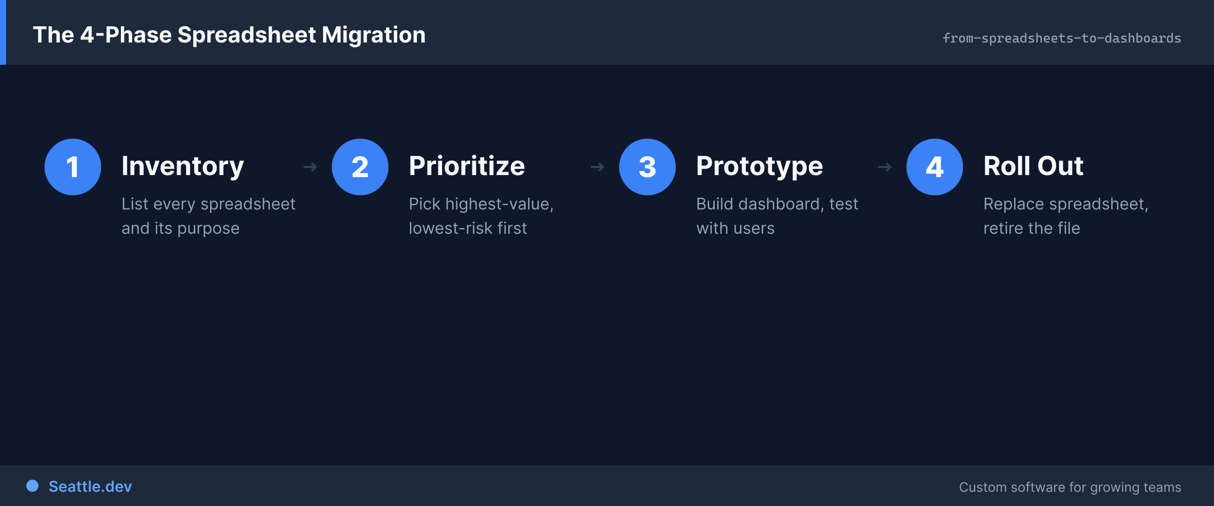
Successful transitions from spreadsheets to dashboards don't happen overnight. They follow a measured process that maintains business continuity while progressively improving capabilities.
Phase one is parallel operation. Continue generating your existing spreadsheets while building and testing the new dashboard. This allows you to validate that the dashboard produces accurate results by comparing against known-good spreadsheet output. Run both systems until everyone is confident in dashboard accuracy.
Phase two introduces dashboard users gradually. Start with early adopters who embrace new tools. Gather their feedback and iterate on the dashboard design. These champions become advocates who help convince more resistant users. Expand access in waves rather than forcing everyone to switch simultaneously.
Phase three phases out manual processes. Once the dashboard is proven and adopted, stop generating manual reports. Redirect questions to the dashboard. Make the dashboard the official source of truth. This transition requires discipline—maintaining both systems long-term defeats the purpose.
Phase four expands capabilities. After replacing the most critical spreadsheets, add new features and data sources. Build on success rather than trying to deliver everything immediately. Each enhancement delivers incremental value and maintains momentum.
The difference between dashboards people love and dashboards people ignore comes down to thoughtful design that prioritizes user needs over technical possibilities.
Put the most important information first. Users shouldn't need to scroll, click through menus, or search to find critical metrics. The first screen should answer the most common questions immediately. Progressive disclosure reveals additional detail for users who need deeper analysis.
Make data actionable, not just visible. Showing numbers without context isn't helpful. Compare current performance to targets, previous periods, and benchmarks. Highlight trends and outliers automatically. Provide clear indicators when metrics require attention. Users should immediately understand not just what the numbers are, but what they mean and whether action is needed.
Design for how people actually work. If your sales team checks metrics on their phones between meetings, the mobile experience must be excellent. If executives review dashboards during weekly meetings, ensure dashboard displays work well on large screens. If operations staff keep dashboards open all day, optimize for quick scanning and immediate updates.
Reduce cognitive load through smart defaults. Most users want to see their own data, not everyone's data. Default to personalized views showing information relevant to each user's role. Allow filtering and customization for power users who want different views, but make the default view immediately useful.
Provide context that enables understanding. Add annotations explaining metrics, tooltips clarifying calculations, and help text guiding interpretation. Users shouldn't need to ask what a metric means or how it's calculated. Context built into the interface makes dashboards self-service tools rather than sources of confusion.
Common Migration Mistakes and How to Avoid Them
Organizations attempting spreadsheet-to-dashboard transitions frequently stumble over predictable pitfalls. Learn from others' mistakes rather than repeating them.
Replicating spreadsheet layouts in dashboards. Just because data was organized a certain way in spreadsheets doesn't mean that organization works best in a dashboard. Take the opportunity to rethink how information should be presented. Optimize for digital display, not printed pages.
Ignoring data quality problems. Spreadsheets often contain workarounds for data quality issues—manual corrections, duplicate removal, and inconsistency fixes. Automating without fixing underlying data quality problems just automates bad data. Address data quality at the source as part of the migration.
Underestimating change management. Some team members will resist moving away from spreadsheets they've used for years. This isn't stubbornness—it's legitimate concern about learning new tools and losing familiar workflows. Invest in training, provide support, and give people time to adapt rather than forcing abrupt change.
Building dashboards that require specialized skills. If only one person understands how the dashboard works or how to make simple changes, you've just moved the dependency from spreadsheet expert to dashboard expert. Build systems that are maintainable by reasonably technical team members, not just the person who built them.
Focusing on perfection instead of progress. Waiting to build the perfect dashboard means continuing to suffer with spreadsheets longer. Launch with core functionality that solves the biggest problems, then iterate based on actual usage. Progress beats perfection every time.
The Technology Stack That Powers Modern Dashboards
Understanding the technical foundation helps you evaluate options and make informed decisions about custom development versus off-the-shelf tools.
Modern dashboards typically consist of several layers working together. The data layer connects to your various source systems and consolidates information in a central database optimized for analytical queries. The processing layer handles data transformations, calculations, and aggregations. The presentation layer provides the user interface that displays information and handles interaction.
For custom dashboard development, proven technologies deliver reliability and maintainability. PostgreSQL provides a robust database foundation that handles everything from simple startups to massive enterprises. Modern frontend frameworks like React or Vue create responsive interfaces that work across devices. API layers built with Node.js or similar technologies connect everything together efficiently.
Cloud hosting with providers like AWS or Vercel delivers scalability and reliability without managing physical infrastructure. Automated deployments and monitoring ensure the system runs smoothly with minimal operational overhead.
The technology matters less than the architecture. Well-designed dashboards separate concerns cleanly, making them easier to maintain, extend, and troubleshoot. Poor architecture creates technical debt that becomes expensive to address later.
Measuring Success After Migration
Successful dashboard migrations deliver measurable improvements across multiple dimensions. Track these metrics to quantify ROI and identify areas for further enhancement.
Time savings from eliminated manual work. Calculate hours previously spent on manual reporting and data compilation. This should drop dramatically after migration. If it doesn't, investigate why—perhaps the dashboard doesn't fully replace manual processes or adoption is incomplete.
Decision cycle time reduction. How quickly can you go from question to answer? Before dashboards, getting specific data might take hours or days while someone compiled information. After migration, answers should be available in seconds or minutes.
Data access democratization. More people should be able to access and understand data independently. Track support tickets and questions about data availability. These should decrease as self-service capabilities improve.
Error reduction in reporting. Human involvement in data processing introduces errors. Automated dashboards should be consistently accurate. Track corrections and adjustments to understand improvement.
User satisfaction and adoption. Survey users about dashboard utility and ease of use. Track login frequency and time spent using dashboards. High engagement indicates successful design and implementation.
Taking the First Step Away from Spreadsheet Dependence
The gap between where you are—dependent on manual spreadsheet processes—and where you want to be—with automated, real-time dashboards—can feel overwhelming. The key is starting with one high-value use case rather than trying to transform everything simultaneously.
Identify your most painful, most frequent, or most critical spreadsheet-based process. Map out what data it requires, what calculations it performs, and what decisions it informs. That becomes your first dashboard project—focused, achievable, and valuable.
Success with that first project builds momentum, demonstrates value, and develops organizational capability for subsequent projects. Each migration makes the next one easier as you build reusable components and establish patterns.
Ready to modernize your business intelligence and eliminate spreadsheet dependency? Schedule a consultation to discuss your current spreadsheet workflows and explore how custom dashboard development can transform your operations. We'll help you identify the highest-value starting point and create a realistic migration plan that delivers results without disrupting your business.
